
Jolly Time Healthy Pop Popcorn
developed for
- Packaging System, UX/UI
![]()
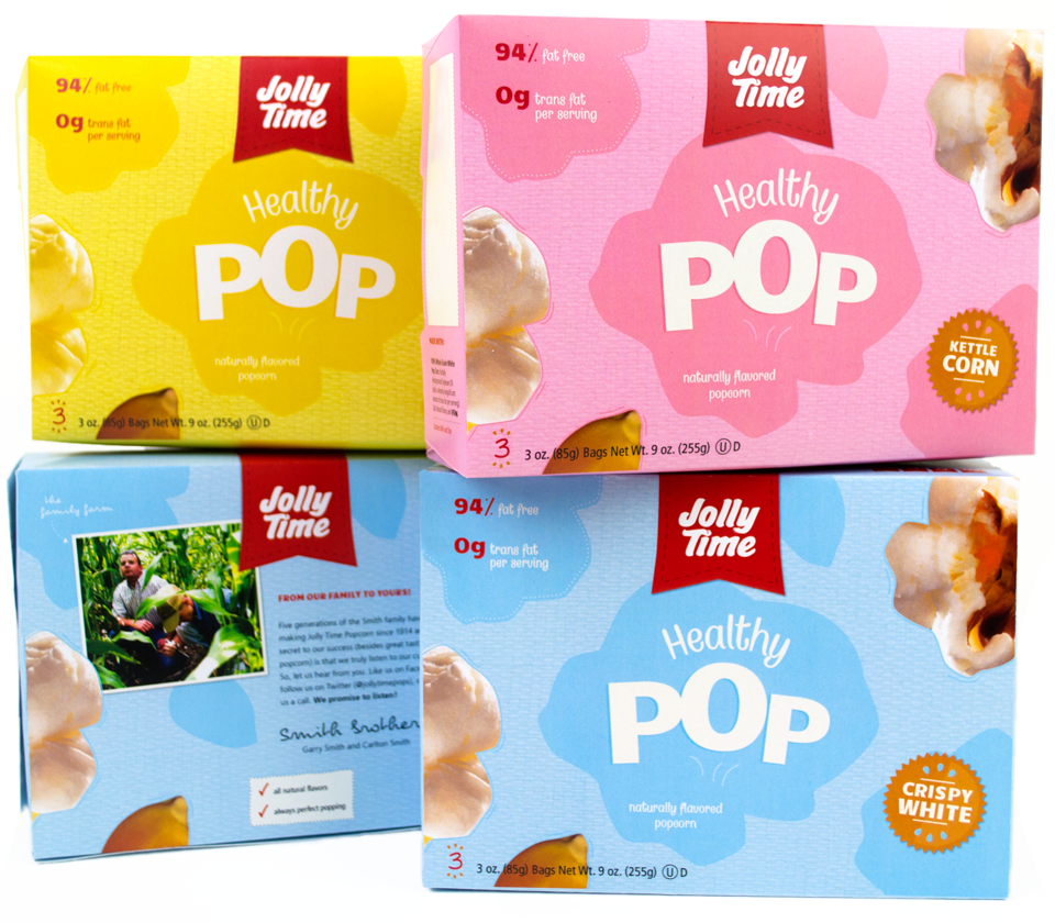
Here’s the problem: The previous packaging utilized fluorescent orange and poor product imagery that did little to communicate “healthy” to a consumer. The shelf presence was poor due to it’s lack of information hierarchy, obnoxious color, and illegible text.
![]()
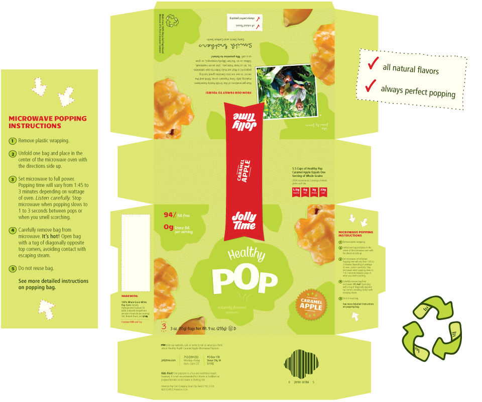
For which I have a solution: The solution includes new packaging that rides the fine line between communicating fun for kids and nutrition for parents. In many cases, both audiences are a part of the buying decisions in the grocery aisles.